Impact Reporting 2024: Cross-Industry Insights
People, Planet, Product & Programs


We reviewed 50+ 2024 impact reports across industries and sectors. The series explores how organizations shape their messages—through design, layout, frameworks, and evidence of impact.
Across these reports, the center of gravity shifts by sector. Retail, tech, and manufacturing mostly keep people, planet, and product as the key themes. Across technology and manufacturing, climate takes the lead, with a focus on renewable energy, efficiency, water, and waste. Education and healthcare lean closer to nonprofit reporting, with a heavy emphasis on programs, partners, and access. A few companies that published reports last year did not publish 2024 reports, likely reflecting shifts in U.S. socioeconomic trends.
Here are some of the specifics that stood out:
How have impact reports changed?
We noticed a few firms that previously led with “impact” now use “sustainability” or “responsibility” as the top label. In these cases, the reports appeared to shift their emphasis towards environmental risk and governance details, with a lighter focus on employee programs and initiatives.
As for report formats, while several companies still publish downloadable PDFs, others have moved to web-only publishing. REI’s 2024 report is fully digital, comprising several linked pages. This makes it easy to dive into a particular section of interest, but makes it less likely that someone would review the report from beginning to end.
UL Research Institutes is an outlier on format. The report consists of short, video chapters. It presents as educational and human, and you get narrative, context, and faces, not just slides. The tradeoff is that it is more difficult to identify the bottom-line metrics and track trends.
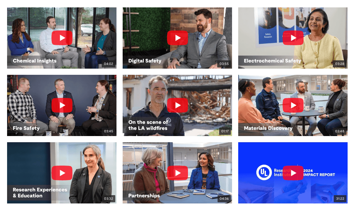
UL Research Institutes is an outlier on format with content presented in short, video chapters.
How does visual styling affect the impact of impact reports?
By-the-numbers
TOMS showcases its by-the-numbers metrics through its B Corp standing.
Almost every report leads with a by-the-numbers feature. This is important as it allows the reader to quickly digest the high-level information, and it’s usually a nice shareable piece of content. The stronger versions add some context to the datapoints. eBay pairs key metrics with language that ties the metric to published targets. That is helpful to understand both achievement and progress at a glance. TOMS showcases its by-the-numbers metrics through its B Corp standing. This adds additional credibility, reflecting performance against an independent standard with required thresholds, not just internal targets.
Human-centered vs. journal-style
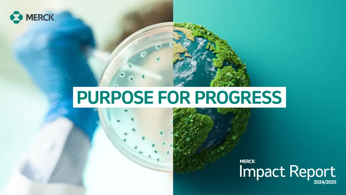
Merck and Pfizer both publish detailed, professional reports. Merck skews dense and clinical, more like a medical publication. Pfizer leans into people-first imagery and breaks up the depth with clearer diagrams and program visuals. Same rigor, different reading experience.
Navigation and wayfinding
Blackbaud‘s table of contents page stands out as a well-designed, clear visual overview.
Blackbaud stands out for wayfinding. Even the table of contents page stands out as a well-designed, clear visual overview, setting the stage for the report content. Additionally, a running header shows where you are in the publication. Simple, effective elements that make a long document feel more accessible.
Cohesive layout and color discipline to aid readability
A steady color palette and purposeful, high-impact photography give long reports rhythm, clear cues, and visual rest. Interface offers an example of a very long, well-organized book, but the palette shifts through the report without a clear system, and the pages could use more prominent photography to break up density. Mohawk shows the opposite approach: big imagery and a consistent, colorful scheme carry through, which feels coherent and easier to stay with.


Visual authenticity and honesty
Visual tools like timelines or collage-style layouts can help companies convey authenticity, and a slightly less polished look can work well when used intentionally. Whole Foods uses a timeline to show how its practices have evolved, allowing it to be transparent about where work remains while demonstrating steady progress. Both Flashfood and Sargento lean into collage-like layouts and imperfect but lively imagery that feels human and accessible.


Publishing impact reports for experts as well as consumers
Across industries, impact and sustainability reports range from self-reported impact snapshots to corporate publications prepared in accordance with frameworks like GRI, SASB, and TCFD, among others. The more corporate reports can be less consumer-friendly, but their depth and complexity require long-standing commitment and significant resources. These efforts should not miss the opportunity to use deliberate design approaches that help communicate this important information to broader audiences. Strong summaries and dashboards, or even an overview video, are powerful communications assets and should not be an afterthought.
Opportunities to strengthen impact reporting
Show trend lines and longitudinal information
Many reports are still snapshot-heavy, meaning you get a clean picture of the reporting year’s activity, but not always trend lines. Year-over-year data and longer-horizon information speak more to the organization’s longstanding commitment.
Include more receipts
Even if a company is not yet using third-party frameworks to manage and measure impact, adding proof points or “receipts” builds credibility. Third-party recognitions such as best-places-to-work lists, certifications, or verified ratings carry weight, while outcome stories and lessons learned show impact created. Receipts also cut through politicized or overused labels, as showing outcomes keeps the intent clear.
Don’t forget the human voice in impact reporting
Include a message from leadership or the sustainability team. It signals accountability and gives context for the data that follows. For example, while Tesla’s reports are strong on design and data, a brief human intro could add a human connection. Whole Foods offers a good example here with a letter from the VP of Sustainability that thanks teams and partners and explains the why behind the work.
Messages from leadership and the team bring a human voice and vision to help frame the report data.
Read the rest of the 2024 impact reporting series:
Inform Solutions is a creative services firm that amplifies the impact of innovators. Ready to launch your impact reporting program? Get in touch.